Scholastic: Mockingjay Design System
Introduction
For two years, I led the Mockingjay Design System at Scholastic. The system had low adoption and unclear standards when I stepped into the role. Teams were facing complex product needs without a shared structure. My goal was to create a system that supported real workflows, helped engineers ship faster, and made design more accessible for everyone.
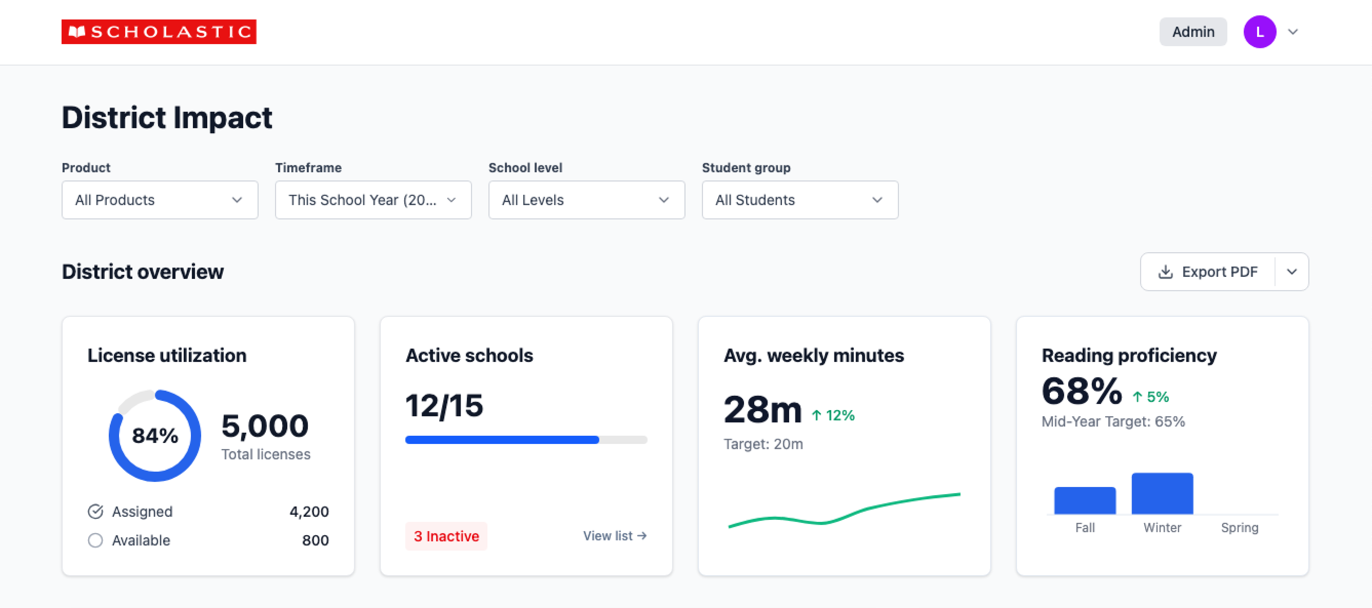
This case study outlines how Mockingjay became a trusted, company-wide resource supporting K to 12 experiences, middle school features, teacher tools, and district dashboards.
Context and Problem
Where it started
Before I led the system, Scholastic had disconnected guidelines and no reliable source of truth. Designers, including myself, rebuilt components from scratch. Engineers recreated patterns without shared standards. Teams continued to ship work, but consistency across products was low.
The previous system was not flexible enough for enterprise needs. It lacked tokens, documentation, accessibility structure, and champions to guide adoption or improvements.
My first year on the Data Viz team
How I Earned The Role
In my first year on the Data Viz team, I handled complex enterprise interactions and built a custom system that helped my team move faster. When the original DS lead left, I stepped in and shared that work across the org, which helped build trust and momentum.
My experience leading the Yahoo Design System for more than 30 designers, along with my work on Dan Mall’s DSU advisory board, strengthened my credibility and positioned me to lead Mockingjay.

DSU's Customer Advisory Board
Team and Structure
- 1 PM
- 3 Engineers
- 1 Part-time designer
- Myself as the design system lead and owner
The team was small, so I took on many responsibilities that would normally be handled by separate roles.
My hats
- Vision and strategy
- System audits and research
- Token and component architecture
- Workshops and training
- Zeroheight documentation
- Accessibility leadership
- Relationship building with product teams
The DS Team at Scholastic
Establishing a System Mindset
To move the organization forward, I knew we needed a shared understanding of what a design system really is. I suggested that a small group take a design systems course early, so we could align on the principles needed to build something scalable and usable. Leadership approved it, and three of us took Dan Mall’s course together. It gave us a shared language, a common mindset, and a solid foundation to move forward as a unified team.
Leveling up together
Listening First: Research Across the Org
We met with senior leaders, PMs, engineers, and designers across the organization to understand their expectations and challenges. I asked how they defined a design system, what successful adoption looked like, and where the gaps were.
Common themes
- Lack of documentation
- No accessibility guidance
- Low adoption
- Inconsistent support
- No shared vocabulary
- Unclear starting point for teams
Listening first gave me a clear picture of what teams truly needed and helped shape a system grounded in real problems.

Listening First: Key Findings
Building the foundation
Audits and extraction
I reviewed old style guides, previous system attempts, and product UI across teams. I extracted reusable decisions to build a more stable foundation.
Token architecture
I worked with engineers early and agreed on a Tailwind-compatible structure. I taught myself Token Studio so I could generate JSON that engineering could use into their build process.
This helped build trust and saved engineering hours on mapping design to code.
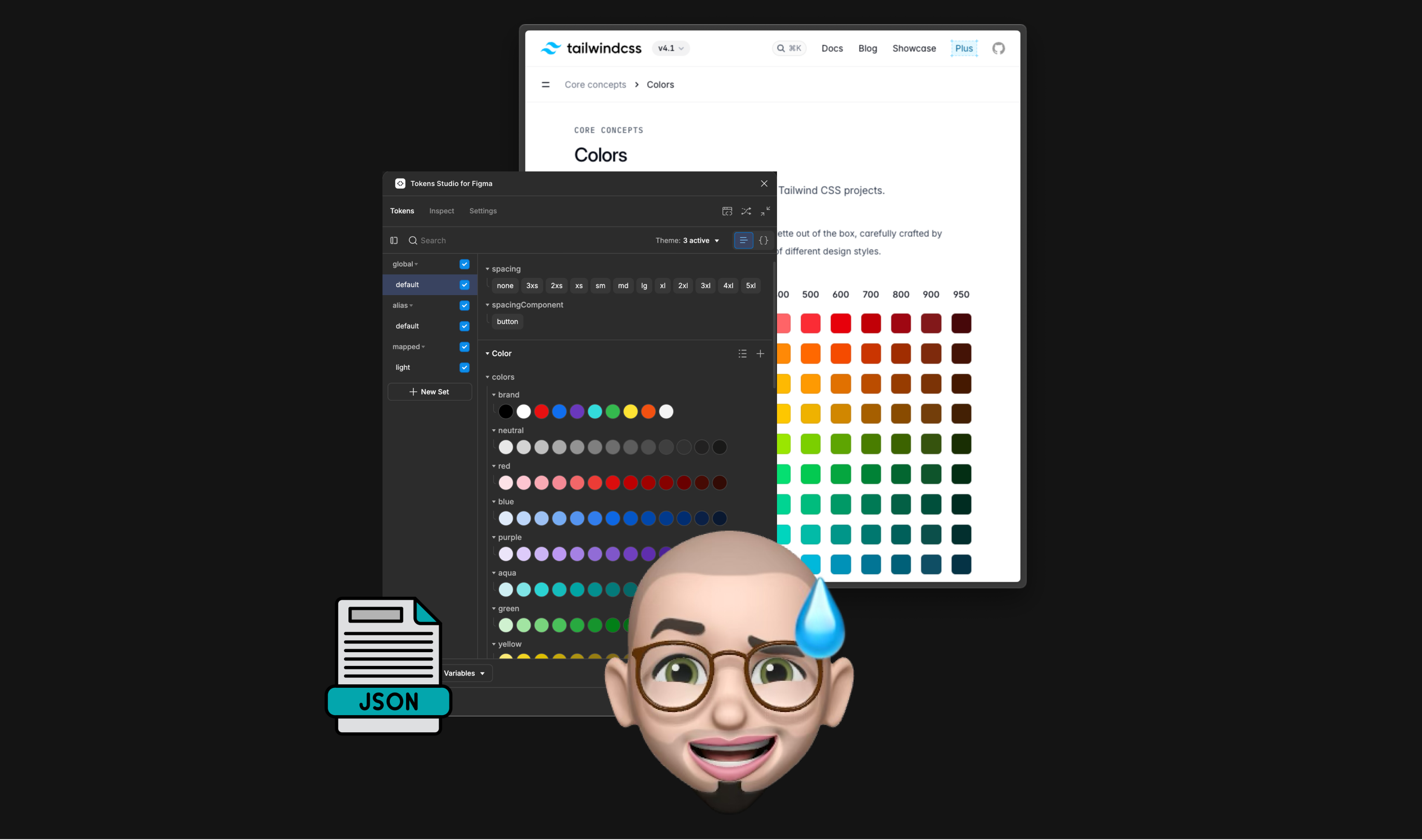
Taught myself Token Studio to generate JSON from Figma
An Inclusive Entry Point For Everyone
Different roles needed different ways in.
- Designers used Figma.
- Engineers used Git and Storybook.
- PMs needed a clear place to browse.
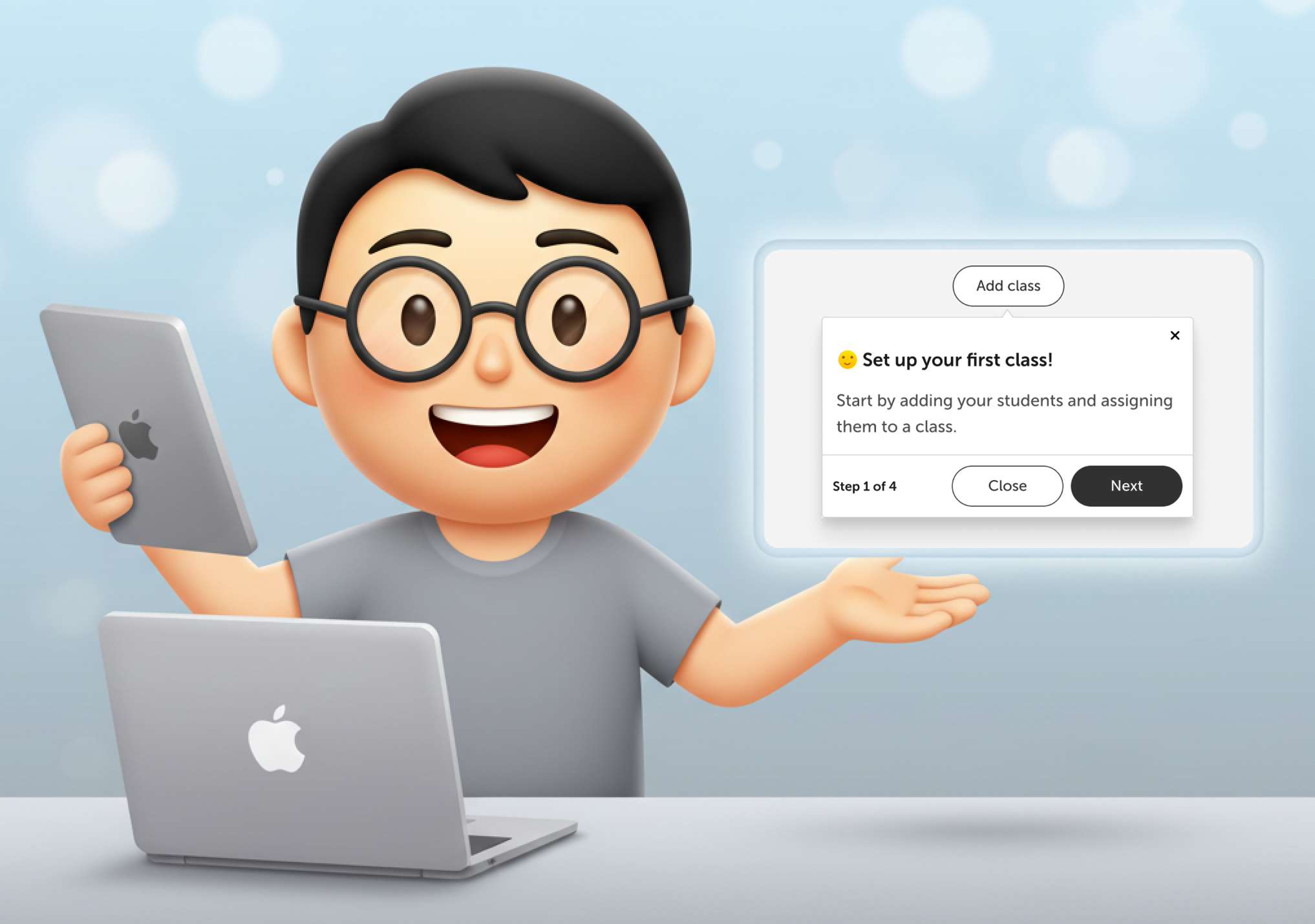
Mockingjay on Zeroheight became the central hub. No matter your role, you could start from where you were most comfortable.
This boosted adoption and made the system feel approachable.
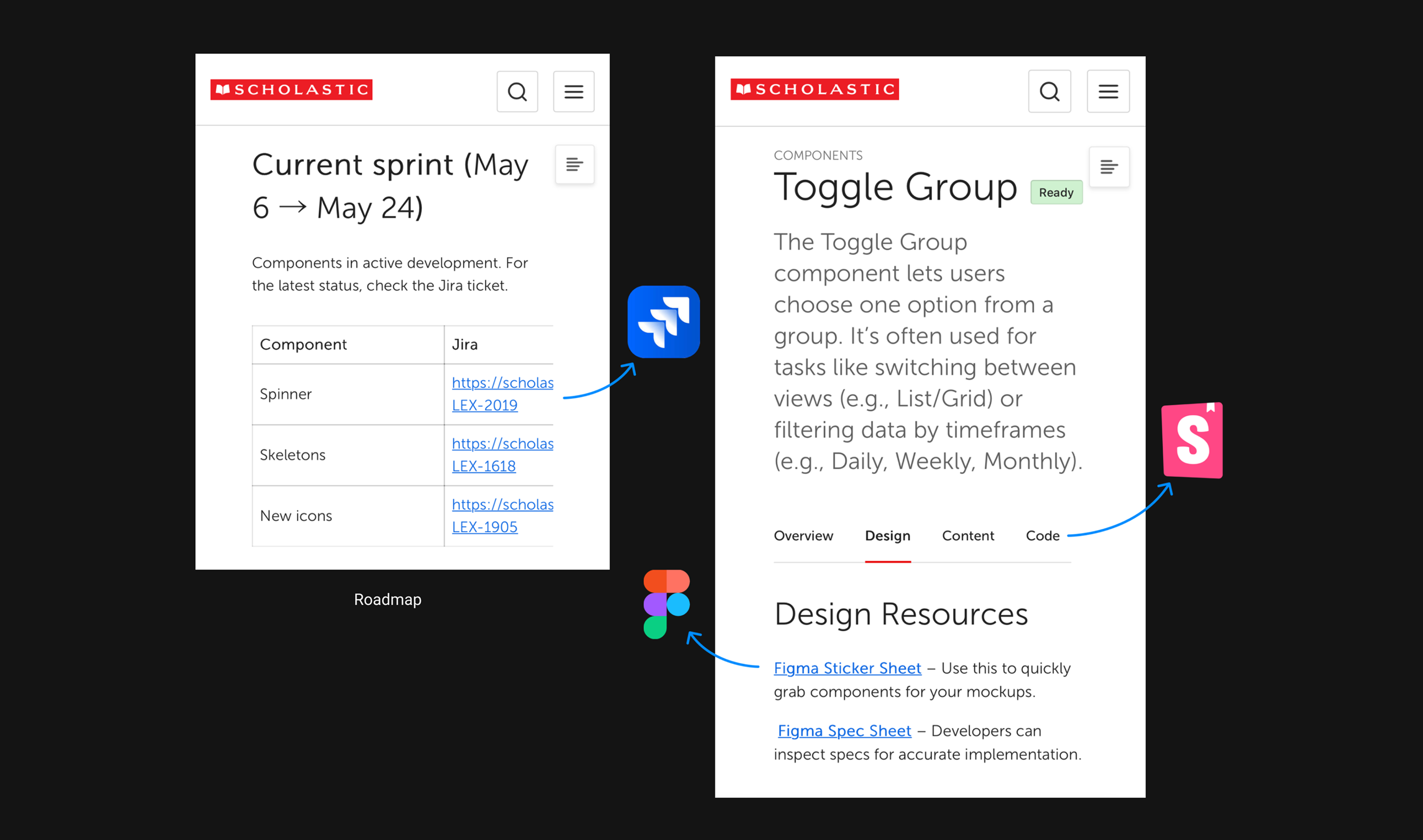
Different roles, different ways in — same source of truth
Design Decisions With Intention
I documented not just the “What,” but the “Why.”
Examples
- Popover vs Dialog vs Drawer
- When to use which and why
- Sizing rules
- Behavior expectations
- Best practices that matched engineering constraints
This reduced ambiguity and helped teams make faster decisions with fewer reviews.
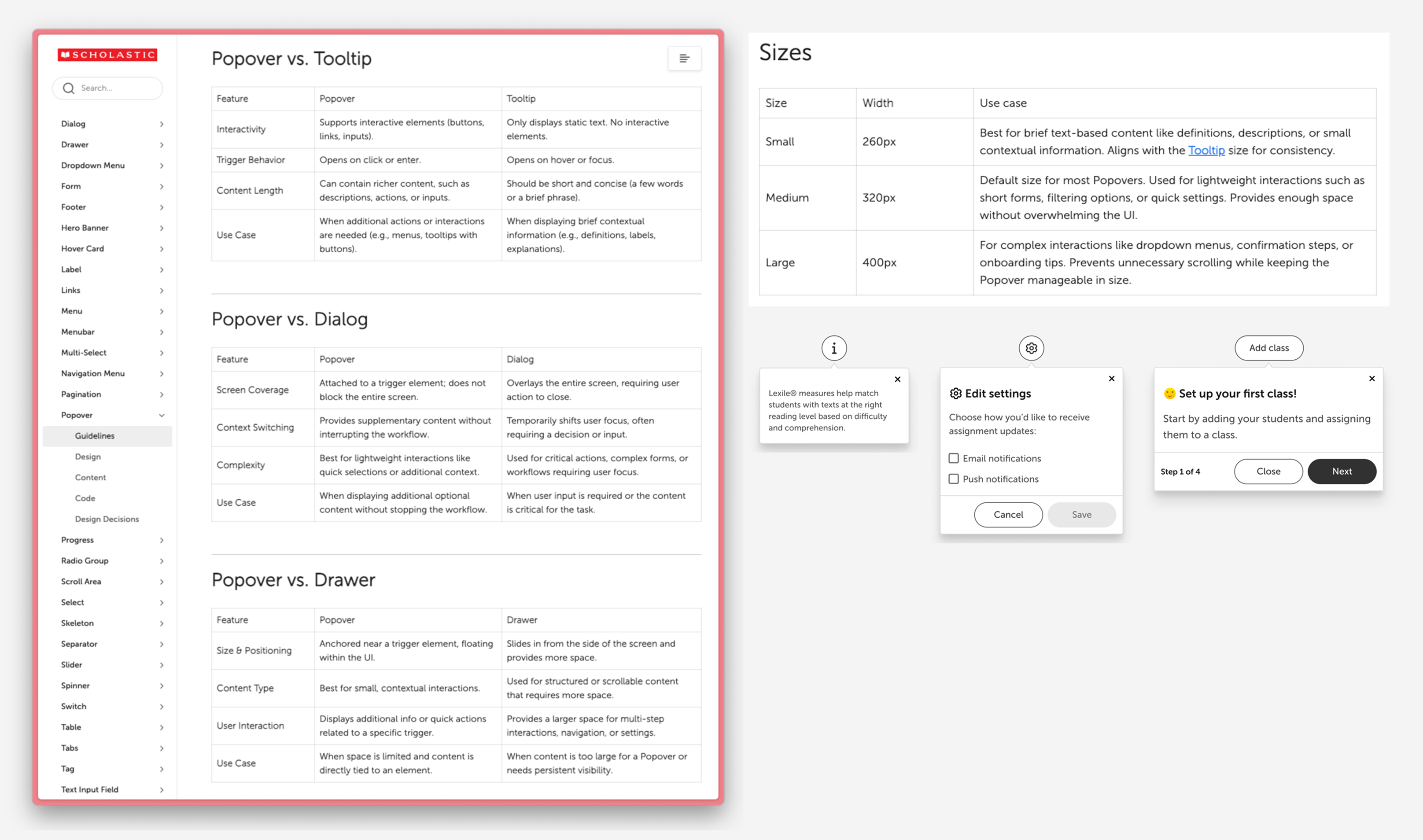
Design decisions with intention
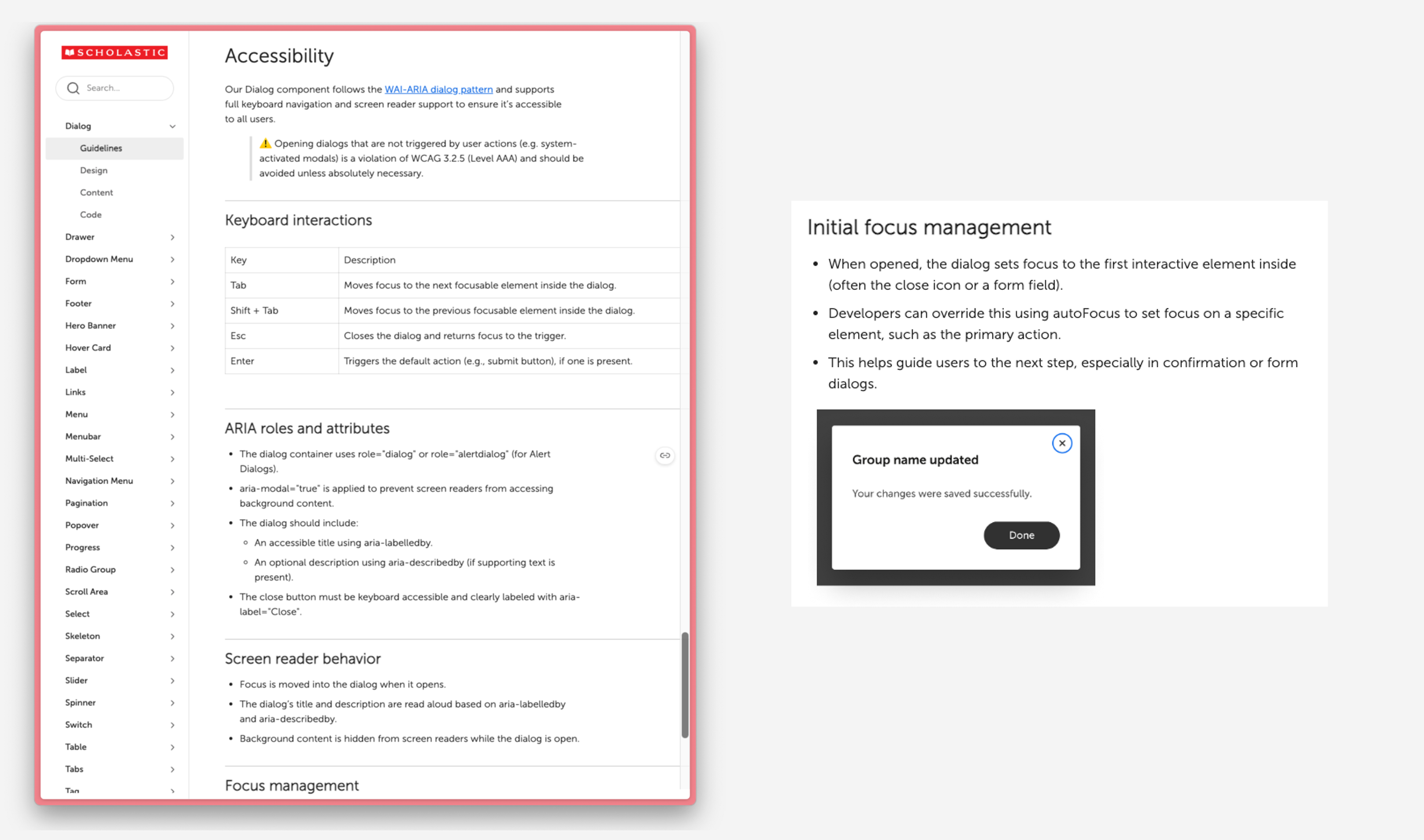
Accessibility Built Into the System
Public school products must meet strict accessibility requirements, and without them, our products cannot be sold to schools. Engineers needed clear and actionable guidance, so I documented ARIA roles, focus behavior, keyboard patterns, and accessible defaults.
I also served as a design advocate in our Accessibility Center of Excellence (ACE), helping teams shift from “checking the box” to designing with inclusion from the start.
Accessibility became a core value of the system.
Accessibility built in
Writing For Everyone
Documentation was written at a seventh to eighth grade reading level to ensure clarity for everyone. This helped:
- ESL team members
- Non technical roles
- New designers
- New engineers
I focused on clear, simple language over complexity.
I used Scholastic’s own Harry Potter series as inspiration. Part of its success comes from being written in a way that readers of many ages and reading levels can understand it. I brought that same approach to our internal documentation.
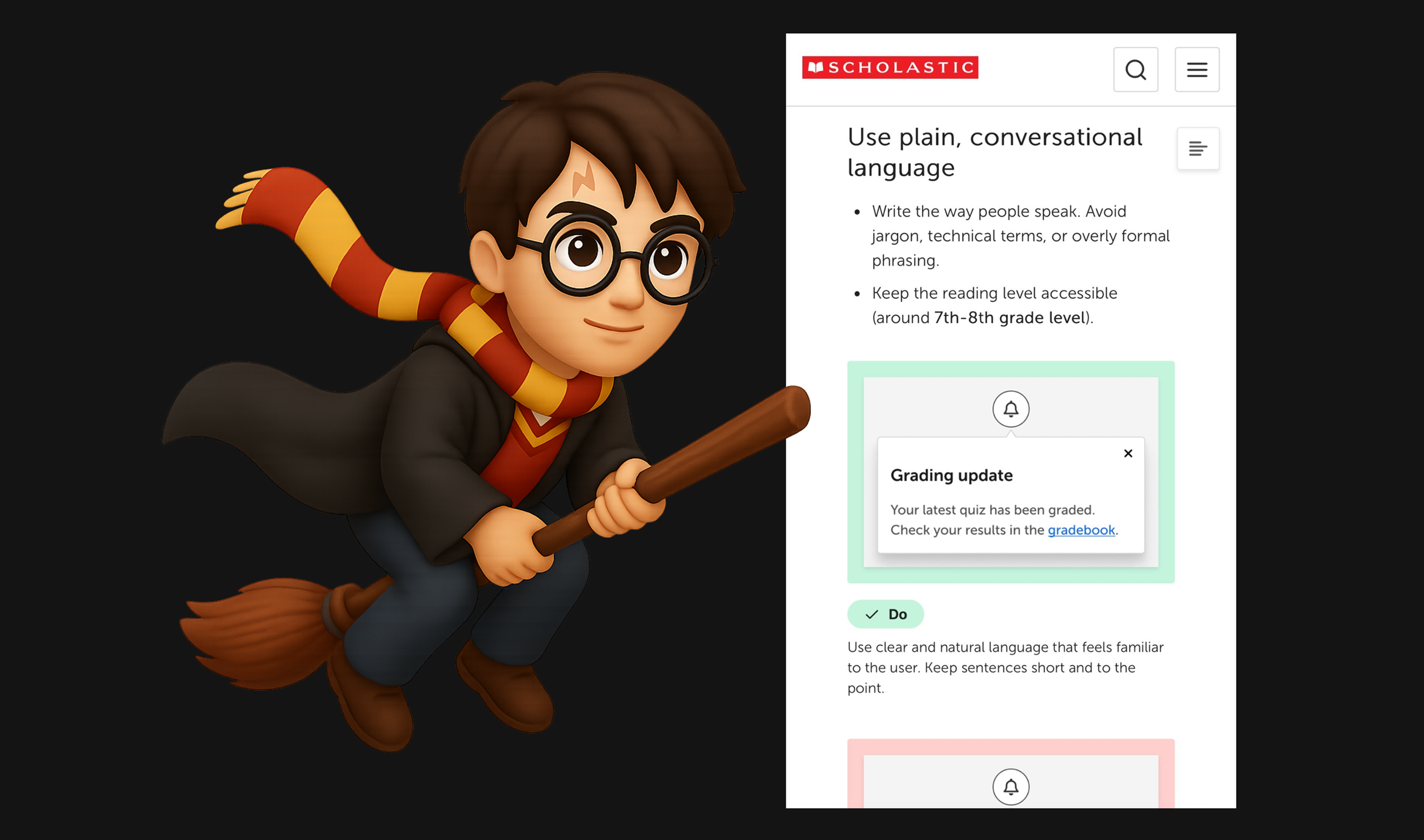
Inspired by how Harry Potter is written
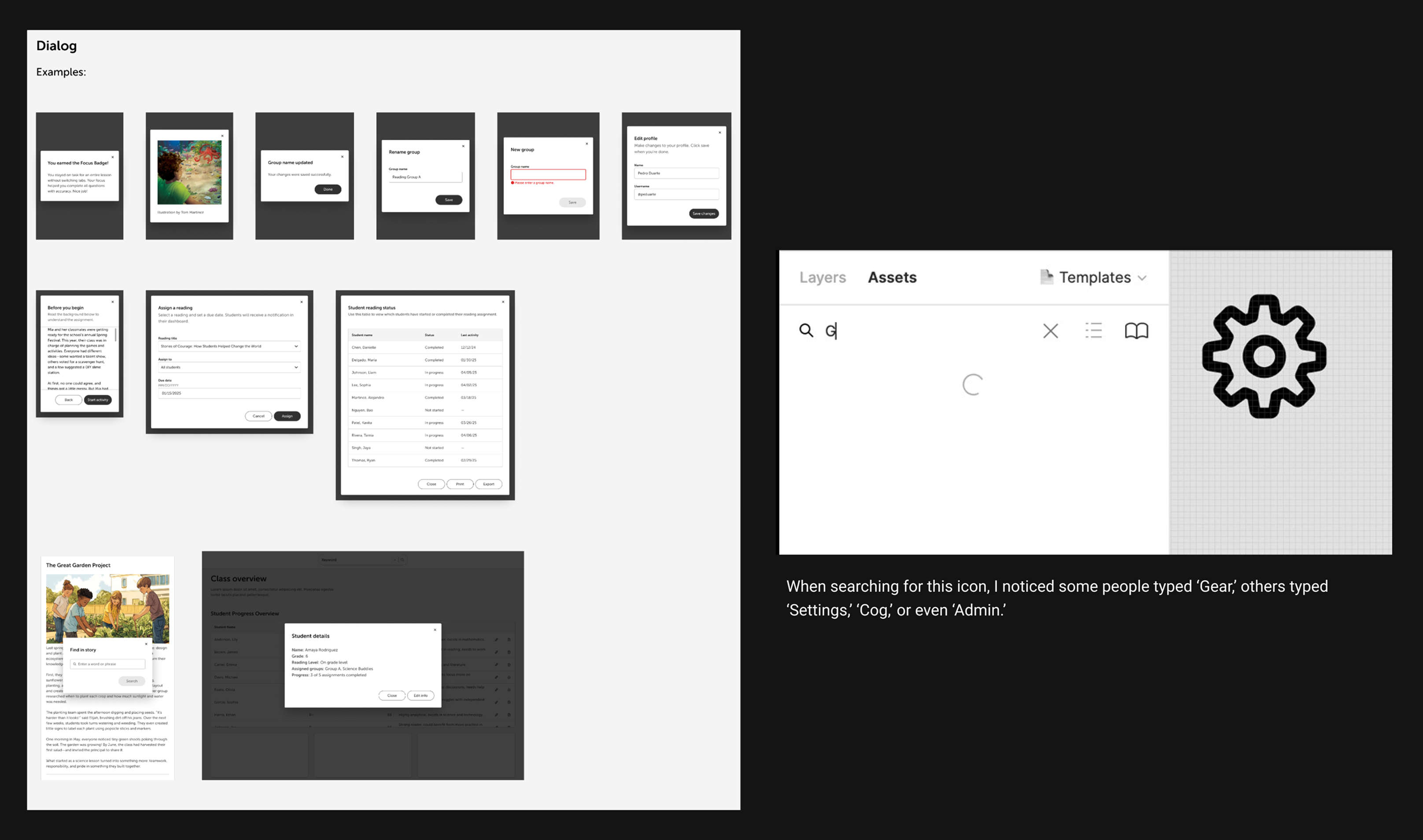
Process For Faster Work
Figma sticker sheets
I created grab-and-go layouts based on real product patterns. Designers did not need to customize or rebuild components. They copy and paste.
This cut design time and improved consistency.
Metadata and search
Different teams used different words for the same thing, so I added alternate keywords to help everyone find what they needed.
Designing for how people work and think
Everything Stays Connected
To make the system easy for everyone to use, I connected design, code, and documentation in one flow. From Figma, teams could jump directly to Storybook for engineering details and to Zeroheight for full documentation. No one had to search for specs or wonder where anything lived. Every component carried its own links, so the context traveled with it.
This kept designers and engineers aligned, reduced back-and-forth, and made the system simple to use across all tools.
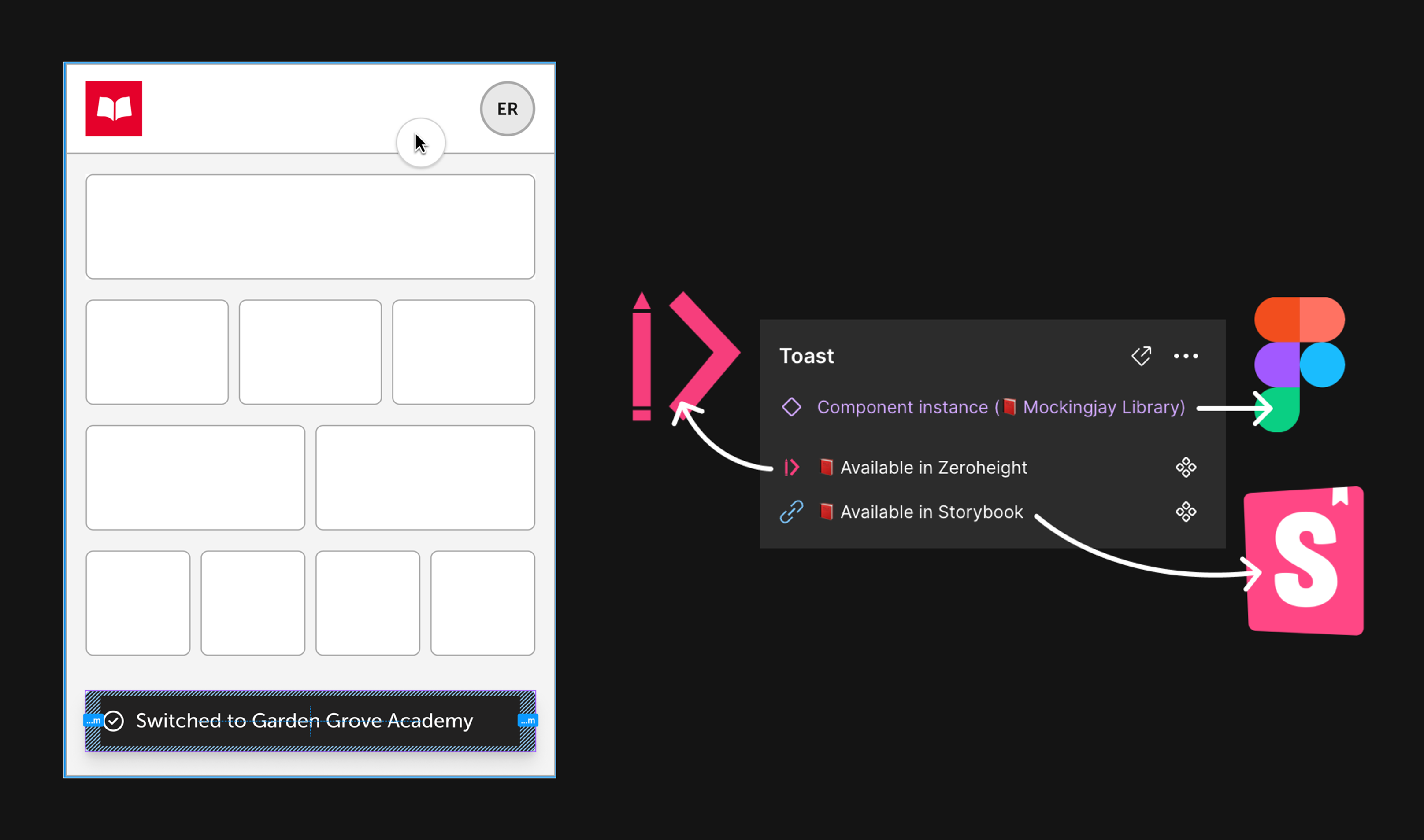
Extending design to code + documentation
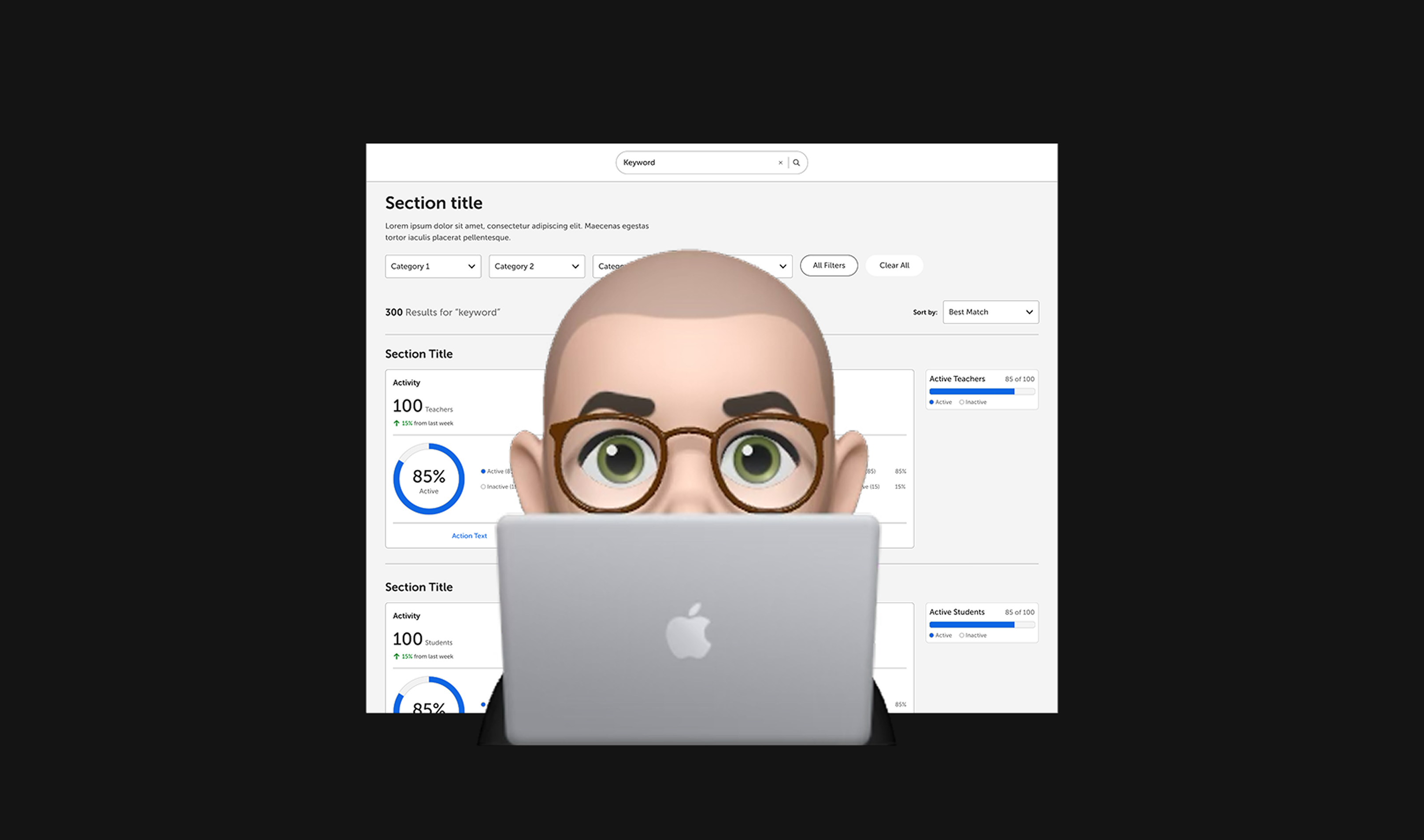
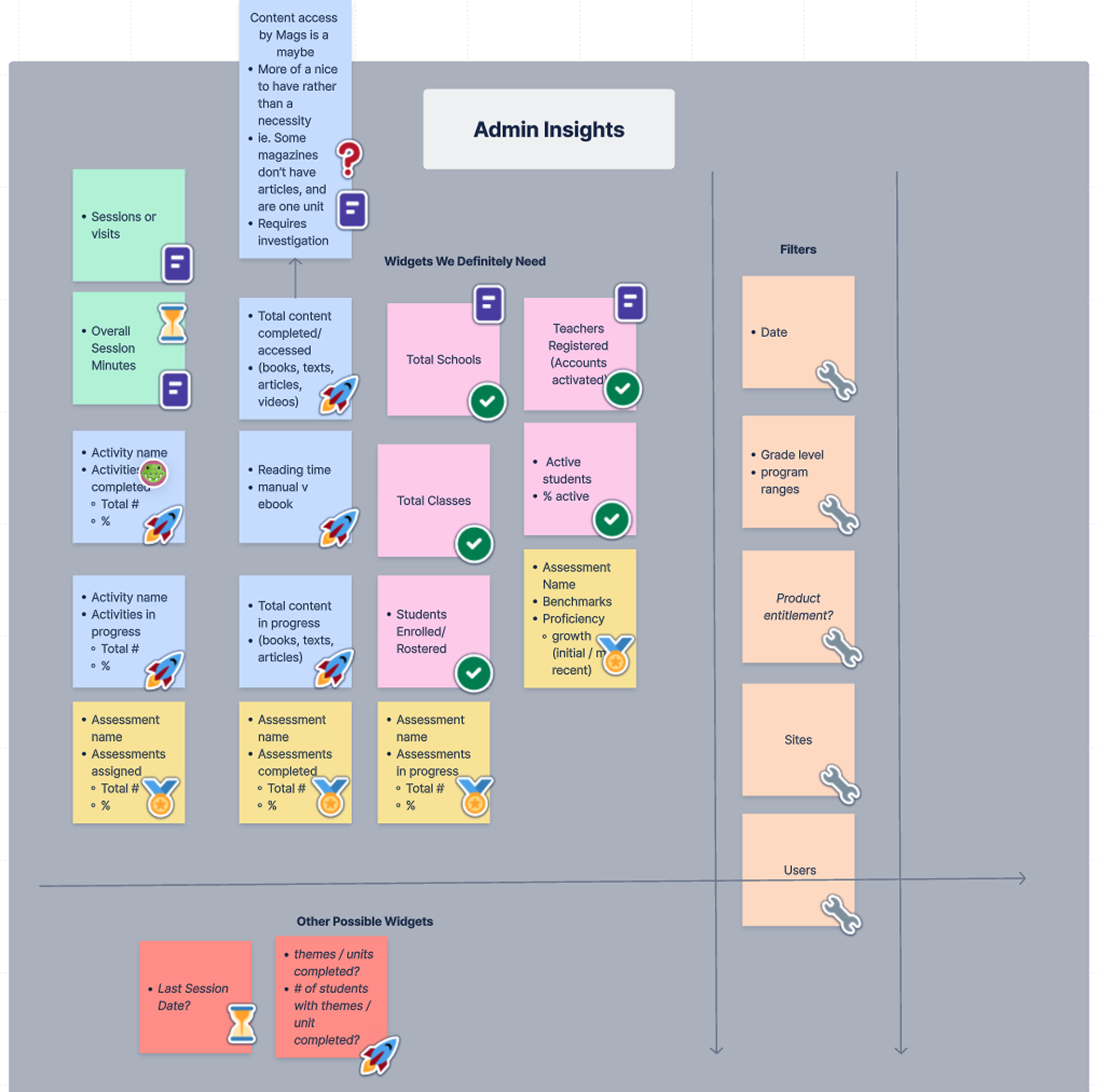
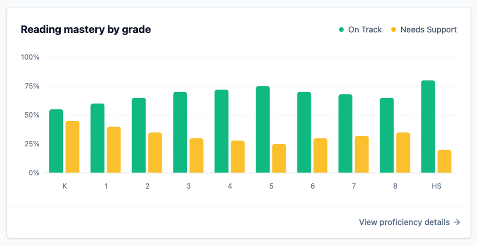
Designing With data
I used Figma analytics to track how components were being used, where they were getting detached, and where designers were running into friction. When I noticed a pattern, I reached out directly to designers to understand the real problem behind it.
One clear example was the Tabs component. The first version only supported three items, but designers kept detaching it because their use cases needed more flexibility. After hearing that feedback, I expanded the component so teams could add more tabs. Once I shipped the update, detachments dropped and consistency across products improved.
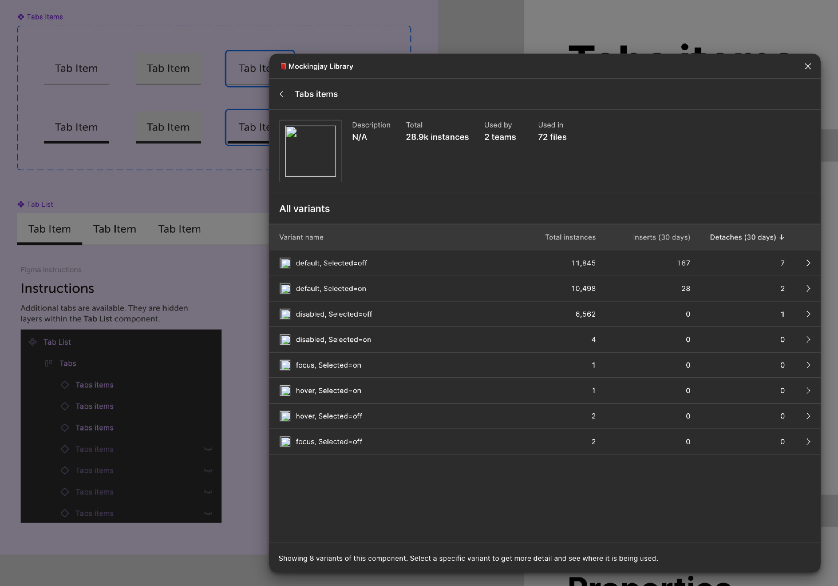
Figma analytics showing component usage
Government With Boundaries
In a design system, boundaries keep the whole organization moving in the right direction. I learned early that I could not say yes to every one-off request. If I tried, the system would slow down and lose trust.
So I kept it simple.
If a component supported multiple teams, helped us scale, or aligned with company goals, it moved forward. If it only solved one team’s unique problem, I guided them toward local solutions instead.
Setting clear expectations, being transparent, and explaining the “why” made collaboration easier. It kept the system healthy, and it helped teams understand how to work with me while still feeling supported.

Setting boundaries with transparency and care
Championing The System
I stayed close to the teams using the system. I opened a dedicated Teams channel so people always had a place to ask questions, share ideas, or get quick help. I also hosted regular office hours and live demos so we could walk through new components together and make sure everyone felt supported.
Any time something shipped or changed, I shared clear updates with context and links so teams always knew what was new and why it mattered. The goal was to make the system feel approachable, helpful, and easy to use.
Over time, people began reaching out earlier in their process, asking for guidance, and even promoting system updates on their own. That is when you know a design system is doing its job.

Clear updates with context and links
Real Adoption, Real Momentum
As the system matured, teams began using Mockingjay without being pushed. It showed up in product demos, planning sessions, and cross-team discussions.
Impact
- Designers and engineers became advocates
- More teams asked to onboard
- Releases shipped faster and more consistently
- The system became part of the natural workflow
- Teams trusted the system because it solved real problems
Mockingjay started as a tool, but it grew into a shared culture.
People who use the system, love it, and help spread the word.
Reflection: The system is easy, people are hard
I learned that the system is the easy part. The real work is supporting people who are under pressure and juggling deadlines. Sometimes that stress shows up as frustration with the system, but it is never personal. I learned to listen, stay patient, and meet teams where they are. When people feel heard and supported, the entire system gets better. That is what makes the work meaningful.
Design systems succeed when people feel heard
Personal Reflection
Mockingjay was more than a system. It was a team effort that showed me how much is possible when people trust each other and work toward a clear vision. Leading it helped me understand the kind of designer I want to keep growing into: someone who builds with people, listens with intention, and helps teams move with clarity and confidence.
Takes a village to make a design system work
%202.png)

%201.png)

%201.png)