Yahoo
Yahoo Rize Design System
How I helped evolve Yahoo’s design system to support consistency, accessibility, and team adoption across a global product ecosystem.

CONTEXT + PROBLEM
Business Problem: Yahoo’s ad tech tools were inconsistent, inefficient, and hard to maintain. Multiple teams worked off different design libraries, leading to redundant tools, wasted time, and higher dev costs.
People Problem: Designers were constantly detaching components, suffering from poor documentation, and lacked a single source of truth. Design maturity was low, and collaboration was difficult.
My Role: Design system lead (alongside 1 PM + 1 visual designer):
- Drove the Figma migration
- Designed the component library
- Led training, advocacy, accessibility audits
- Created documentation and system principles
GOALS + CONTRAINTS
Goals:
- Consolidate tools
- Speed up product development
- Improve design quality + accessibility
- Increase collaboration and adoption
Constraints
- Migrated mid-rebrand (Verizon branding retired)
- Figma learning curve for many designers
- Leadership wanted 6–12 month project done in 3

APPROACH
Principles:
- Make frequent choices efficient
- Favor usability over maintenance
- Bake in visual decisions
- Bridge gaps between design and code

Design Tactics:
- Separated distinct variants (e.g., button styles) for faster drag-and-droP
- Used labels, emoji, and screenshots to enhance discoverability
- Created interactive prototypes for non-design stakeholders
- Added metadata (Gear, Cog, Settings, etc.) to support diverse vocabularies
- Surface GitHub links to enable cross-functional collaboration

Culture Work:
- Co-created with designers across teams to build trust
- Advocates presented at meetings, not just you
- Added a versioning system to boost transparency and reduce fear of updates
- Kept documentation at a 4th-grade reading level to promote clarity and inclusion
OUTCOME
- Migrated from Sketch to Figma successfully
- High system adoption with little-to-no component detachment
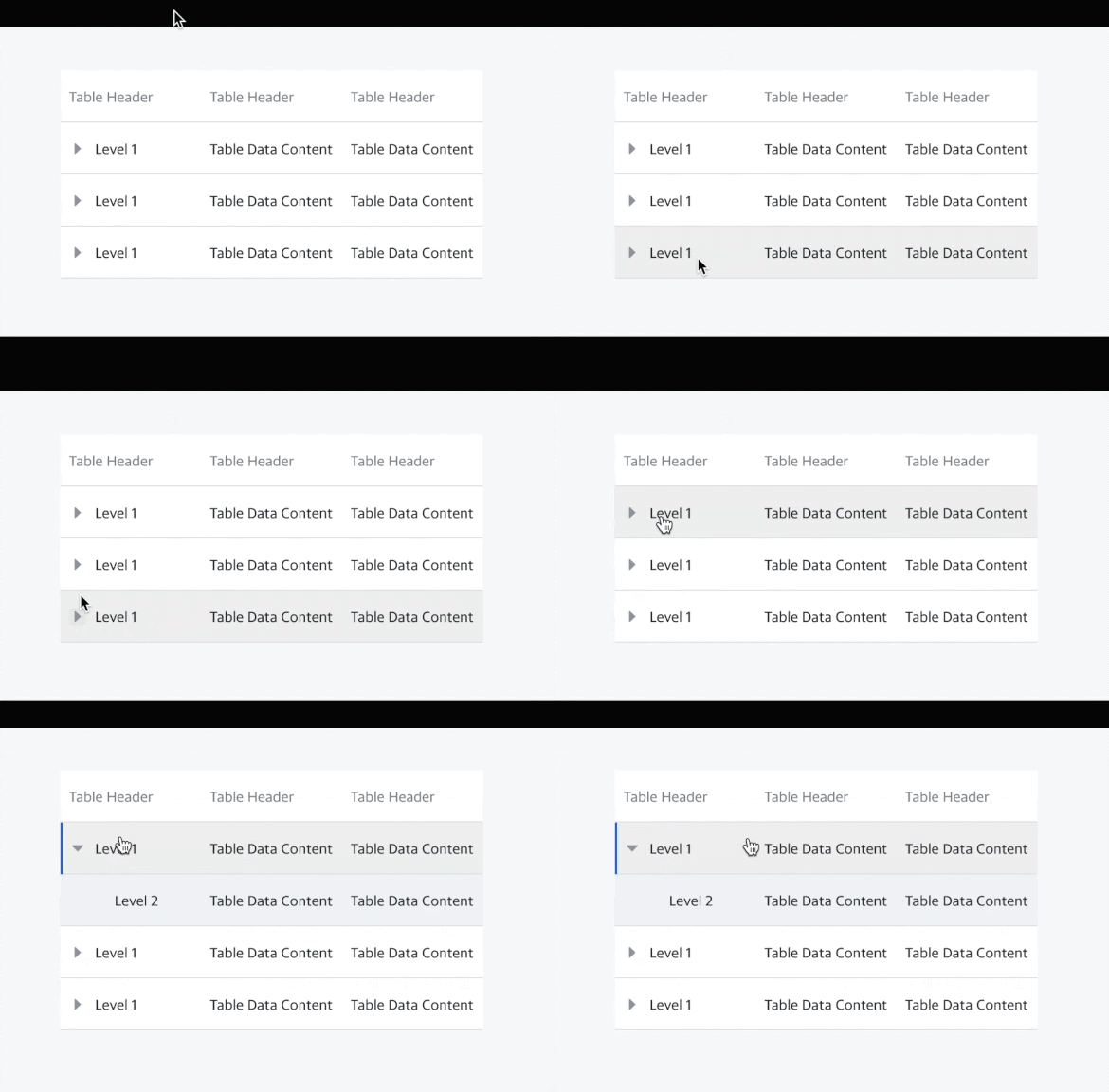
- Data table component alone had over 18,000 uses and only 22 detachments
- Advocates on every team helped scale support without you being a bottleneck

REFLECTION
What I’d change:
- Invest earlier in design tokens
- Plan for responsiveness earlier
- Build documentation in real-time to prevent backlog
What I learned:
- Design systems live or die by company culture
- The best system isn’t just scalable—it’s usable
- Trust is the foundation; everything else is maintenance